Thursday, September 27, 2012

YOU ONLY GET ONE CHANCE TO MAKE A GOOD FIRST IMPRESSION

http://www.youtube.com/watch?v=NdSOfXH4NWA&feature=plcp

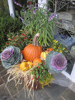
Decorating your front stoop is an important aspect of your overall design. It is the first impression of you and your home, make it as fabulous as you are.  Don't FALL flat with your FALL decorating! Fall is the perfect season to add tons of color and texture to your entry urns, columns, steps and stoop.


Incorporate textural and colorful elements to all aspects of your outdoor decor. In the urns showcased in this week's 60 Second Tip I used:

1 red beach grass
1 green cabbage
1 red, yellow and purple pepper
1 yellow Pansie
1 white Pansie
1 green and purple plant
two long dark green Ivy 
5-7 small pumpkins, gourds or
3-5 larger pumpkins, gourds
1 or 2 cute signs or decorations 


The important thing is to add your personality and creativity into every design.  Give your guests an indication as to what is to come once they enter. In my case it is not a WELCOME but a WARNING :)  What I hope they also expect is football, fun and spiced rum.  With every outdoor decor your are giving your guests an indication of the beauty that lies within.

For each season kdtvdesigns on YouTube and my blog will give you ideas for your seasonal holiday decor. If you have any ideas you would like to share please send your thoughts and photos to us, we want to hear from you.  Fall in love Fall and give yourself a happy warm feeling every time you enter your front door with beautiful outdoor decor.  Once inside have a spiced apple candle burning, or better yet mull cider on the stove.  William Sonoma sells fantastic spices and paraphernalia for mulling.

Enjoy the crisp air and the fall colors of this gorgeous season. 

If the link didn't work check out this week's 60 Second Tip at:

www.YouTube.com/kdtvdesigns


Thursday, August 30, 2012

LIGHTING IS LIKE JEWELRY

WATCH US ON YOUTUBE  http://www.youtube.com/kdtvdesigns

Think of lighting in your home like you think of your jewelery. Sometimes you want jewelry to be center stage and sometimes you want it to just blend in. In many homes I visit lighting is an oversight . In my designs not only is lighting NOT an after thought, in many cases it is a focal point.

There are three kinds of lighting to consider, a good lighting plan combines all three according to function and style. 

Basic Types Of Lighting

Three are three basic types of lighting that work together in your home:
  1. Ambient (general lighting)
  2. Task
  3. Accent
 
Progress Lighting 
Ambient lighting provides your space with overall illumination. Also known as general lighting, it radiates a comfortable level of brightness without glare and allows you to see and walk about safely. It can be accomplished with chandeliers, ceiling or wall-mounted fixtures, recessed or track lights.  Having a central source of ambient light in all rooms is fundamental to a good lighting plan.
Philips Lightolier Task lighting helps you perform specific tasks, such as reading, grooming, preparing and cooking food, doing homework, working on hobbies and playing games. It can be provided by recessed and track lighting, pendant lighting and under cabinet lighting, as well as by portable floor and desk lamps. Task lighting should be free of distracting glare and shadows and should be bright enough to prevent eye strain.
Tech Lighting

Accent lighting adds drama to a room by creating visual interest. As part of an interior design scheme, it is used to draw the eye to paintings, sculptures and other prized possessions. It can also be used to highlight the texture of a brick or stone wall, window treatments or outdoor landscaping.
To be effective, accent lighting requires as least three times as much light on the focal point as the general lighting surrounding it.
Accent lighting is usually provided by recessed and track lighting or wall-mounted picture lights.

*American Lighting Association

The next time you are planning a space make sure to consider your "jewelry"!! Incorporate ambient, task and accent lighting for a full proof plan that will light the way to a fabulous design.

I like my jewelery big and sparkly but I was born with glitter in my veins!


Lighting displayed in the YouTube Video was purchased at:

 The Lighting Gallery
326 East Jericho Tpke
Huntington Station, NY 11726
     631-271-7700
Front Foyer Chandelier                          $375.00
Kitchen Pendants                                     $132.00
Master Bathroom Sconces                     $278.00
Black and White Bathroom Sconces     $172.20


www.youtube.com/kdtvdesigns

Thursday, August 23, 2012

PUT COLOR ON YOUR CEILINGS!

Check out the 60 Second Tip On Our YouTube Channel

youtube.com/kdtvdesigns

Many of my clients think I am crazy when I suggest color for the ceiling. Think about it though, would you paint all the walls in your home the same color white Ceilings are an enormous design opportunity. Just about every room has a ceiling, they encompass a large surface space, are very visible (especially when adorned), and can completely change the mood of a space. Put color to work for you on your ceilings. If you want more height, if you want to lower the ceiling visually, if you want to accent architecture or if you just want an additional opportunity to play with color and texture paint on the ceiling will help.

Metallic ceilings is a trend we saw in the design community over the last few years. They are beautiful, reflect light and create a lot of movement in a space. Recently lacquer paints are having their day. Lacquer adds drama in crisp, clean, modern way.  I have been doing a lot of lacquer recently and look forward to sharing more information on how to use lacquer on your walls, ceilings and re-purposed furniture in future installments.

Special finishes are fantastic but a good old can of paint and a little elbow grease directed upward will transform your room. Select a color that coordinates with your design plan. If you are using a cream, silver and chocolate brown wallpaper (like I did in my client's powder room), the brown or silver are great choices to accent the ceiling.  In another powder room I recently updated for a friend I chose a Navy/Royal Blue color on the ceiling. The inspiration for the color came from the existing navy and white toile wallpaper. I love a light blue ceiling with gold walls in a living room. Another favorite is a buttery ceiling with grey paint in the DR.

When design slowly unfolds to the eye you have success. Your friends may not initially notice the color above but after being in the room awhile they will notice more and more detail. It is similar to watching a rose unfold. The flower is beautiful when you first see it but as it unfolds you get the full effect.  So grab your paint brush and have some fun!!


Thursday, August 16, 2012

SLIPCOVERS CAN BE YOUR BEST FRIEND


Slipcovers serve a multitude of purposes. The cost of a custom slipcover depends on the cost and necessary yardage of the fabric as well as the labor and potential other materials associated with manufacturing.

If you have a young family, pets or just messy guests slipcovers are a brilliant way to dress your furniture. They are extremely easy to remove and launder. I selected white for my kitchen chairs. Everyone thought I was crazy to do so with three kids 1, 6 and 10 (at the time).  Now they are eating crow as it has been three years and each of the slipcovers looks brand new.  Whenever they start to look a little soiled I unzip, throw them in the washing machine and 30 minutes later we are back in business.

Slipcovers allow you to dive into your design choices ie: color, monogram, skirt/no skirt without totally committing.  Many of my clients change their slipcovers with the seasons. White for summer, earthy tones for fall, etc. etc. You can commit without committing forever.  A slipcover can also soften a room with a lot of hard lines.  They usually are a little less structured then upholstery and therefore may add movement to a space.

Finally you can get super creative when designing anything from scratch. Some of my favorite things to do with a slipcover are:
  1. Custom monogram
  2. Welting or a trim to add a finishing detail
  3. A 2-4 inch tape down the center of the slipcover creates interest and drama
  4. Buttons down the back as if your seam is buttoned together
  5. A large bow that ties from behind
  6. Putting a skirt on the bottom
There are a couple type of skirts that you may choose from. Box pleating is one that I use often. A box pleated skirt adds movement while providing a traditional and sophisticated silhouette. Typically a skirt begins at the bottom edge of the seat cushion and can range in height from 2-6inches (or longer if you are looking for drama).  Kelly Hopkins a famous Interior Designer in California uses thin chain trim frequently as a skirt on slipcovers. This technique is really dramatic and allows you to see the legs of the chair through the chain.

Regardless of how you design your slipcover it is a fantastic way to keep furniture looking fresh and clean and allows you to change your decor as frequently as you should so desire.


Sunday, August 5, 2012

Parisian Chic Meets American Country


While on my annual ten day vacation to Vermont I made the ritual stop at North Inc. 127 college street Burlington Vermont. I do not have a country home but this shop year in and out makes me wish I did. Bennington potters North Inc. is an eclectic mix of folk art, Parisian chic meets down home American country. The collections range from hand forged pottery to hand dyed and trimmed textiles to blown milk glasses.

One of the many things I love about this shop is the comprehensive selection. Available is almost every accessory and cookery item one would need to showcase a beautiful assortment of country finery. Today I purchased three interior framed, aged rooster paintings; they are rustic, artsy and chic (not an easy combination to nail). I also purchased carafes with their own baskets. These fun accessories reminded me of the carafes the French use to serve their table wines and water (one and the same it seems in Paris). I could not resist owning one myself and purchased another for our hosts in Paris. I also acquired a print by a local artist, Dug Nap. The print itself is lovely but the hand written caption above the rustic outdoor scene reads: "Hey, it’s a beautiful day". My 2 year old wakes every morning to proclaim the same sentiment. Obviously I had to have it.

The greeting card section of North Inc. is very small relative to the rest of the store but outstanding none the less. I procured several cards. Most likely I will keep the cards themselves but copy the sentiments on stationary I hand make. Here are a few of my favorites:

“How old would you be if you didn’t know how old you are?” (Satchel Paige)
“Life is a great big canvas. Throw all the paint on it you can.” (Danny Kayne)

Referring to having a baby…..” No more life in the fast lane….welcome to warp speed.”

If you find yourself in Burlington Vermont and you have any interest in home décor regardless of your style or sensibility check out bennington potters NORTH INC.
802-863-2221


After a successful shopping excursion make sure to replenish at my favorite street side cafe, Leunigs Bistro at 115 Church Street www.leunigs.com


World famous Catherine Muller hosted Kelly, Kelly's sister and mom at her Floral Design School, Bourgeon in Paris France. In addition to learning some of the basics of floral design, the agenda was focused on The Art of The French Round Garden Bouquet. Just as apparel fashions go in and out of style so too do floral designs. Currently The French Round Bouquet is a fashionable must. Kelly posted a video blog showcasing the course on her youtube channel, kdtvdesigns which you can find at www.youtube.com/kdtvdesigns.


Following are some of the skills and techniques Master Designer Catherine Muller shared.

1. Prepare the flowers 2-3 hours before arranging so they are perfectly hydrated.
2. Use a knife to cut the stems on an angle allowing the flowers to receive more water.
3. If using hydrangea split the stems in half with the knife an inch or two from the bottom.
4. If using roses slice off the prickers and leaves below the water level.
5. If you are right handed hold the bouquet in your left hand.
6. Add one flower at a time with the right hand from the left of the last flower.
7. After adding each flower turn the bouquet 1/4" clockwise.
8. Some flowers should face in toward the middle and others out to create movement.
9. Flowers should be at different heights and angles. Just as interesting as the face of the flower is the flower's profile.
10. When the arrangement is complete tie a bunch of raffia around the stems. Wrap the raffia around the bouquet twice with one stroke down and one up, knotting the stems tight (if using a clear vessel it is interesting to place the raffia below the water line).

Suggested flower selections for The French Round Garden Bouquet:
2 Hydrangea, Hortensia
3 Garden Rose
2 Black Rose (dark red)
5 Rose Prince Jardine
3-5 American Grape, Phytolaca


For more information on floral arranging and other lifestyle tips become a subscriber to Kelly's new youtube channel, kdtvdesigns at www.youtube.com/kdtvdesigns
.


Tuesday, May 4, 2010

Kravet one of the world's largest fabric and furniture manufacturers has asked Kelly of Kelly Dall Interior Design to participate in a presentation Kravet is offering to the Interior Design trade on Thursday May 6th at the Kravet Bethpage Showroom. The presentation will focus on social marketing and the applications that relate to Interior Design professionals and their companies. It is an honor to be a part of the program and as always Kelly's pleasure to help others succeed.